Sunday 9 February 2014
Monday 16 December 2013
Double Exposure and Sandwiching Technique (Analogue)
Double Exposure
This can take a lot of time to perfect but with patience, you can achieve some interesting double exposure effects in the darkroom. You can sandwich two negatives together in the enlargers negative carrier. Align both negatives with their emulsion (dull side) facing down toward the easel.
This technique doesnt work well if the negatives are not of the same density (thickness) Getting the right exposure can take a few attempts so use test strips to determine the exposure before going ahead and printing.
I'm going to attempt this in the dark room, I will shoot a collection of portraits, landscapes and objects with my 35mm film. a silhouette of a person, maybe side profile and maybe a detailed landscaped exposed over it like dense trees or a landscape of buildings.
Sandwiching Technique
With my Canon SLR 50d I shot several silhouette images in studio of myself and other students in a profile portrait. I then shot a few landscape shots of students artwork displayed in the corridors for the background shots. After delveloping the negs I selected the two best negs ensuring that when sandwiched together they did not become too dense and then plcaed in a 35mm neg carrier in the enlarger. I set the aperture to 5.6 and first did a test strip of five second intervals. Below is the first image printed based on that result.
 |
| 1st print based on a five sec test strip, estimated I needed 20 secs, was a little underexposed as the edge of my silouhette was feathered. I did like the way the surround area was white though. |
 |
| With the second full print I increased my exposure to 25 and the magenta to 25. This has brought out the background a touch more but the edges are still feathered. |
 |
| The final print was a 29 second exposure with 25 magenta, not the silhouette is more defined. I was trying to achieve an exposure similar to the second image for the background and the exposure for the silhouette of the third image. I think for me to achieve this I would need to underexpose then burn the profiled area. I could also increase the contrast in lightroom or photoshop. |
Double exposure (in camera)
I went out on a little field trip with my 35mm sprocket rocket loaded with a black and white film. The film was a 35mm 400 so I metered for 200 iso in order for me to achieve correct exposure when I double exposed.
I metered using the sunny 16 method and the majority of my images were shot purposely on the sunny setting with the aperture of f 16. The other setting was cloudy with an aperture of f10.8. Even though it was cloudy I chose the sunny 16 setting as this would allow me to slightly underexpose, giving me the correct exposure when I double exposed that frame. The below images were focused with the 1m to infinity setting as they were landscape styled shots. the shutter speed was set at the day time setting of N setting (1/100).
 |
| Test strip 3 sec, enlarger was set at f8 |
 |
| Final print for double exposure |
I was quite happy with the level of exposure for the final frame and considering it was my first attempt there are only a few minor adjustments I would do next time.
- I would most definitely take advantage of the panoramic framing and print panoramic instead of with a 35mm neg carrier.
- I would like to try the above method of silhouettes with landscape backgrounds, similar to what I achieved sandwiching the two negatives like above.
- The actual image above could have been perfected with some dodging and burning. I would burn and dodge the shadows and highlights of the clouds in the sky and I would dodge the darker over exposed sections of the trees in the background landscape to even out the exposure of the trees across the image.
- The silhouette figure to the right could probably do with burning to match the contrast of the other two figures.
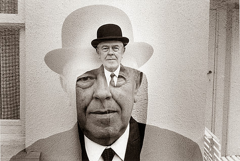
Photo montage technique dates back to as early as the late 1800s when Saint Thomas D'Aquin released his magical image Man Juggling His Own Head.
 |
| Man Juggling His Own Head, ca. 1880 Saint Thomas D'Aquin |
This technique is relatively easy to do. You simply print your selected negatives, carefully scalpel the image you wish to overlay and place on the background image. Then photograph another image of this and print.
I am in the process of developing my negatives to demonstrate my attempt at this method. I have used my SLR with black and white film and taken images of my daughter hanging from a climbing frame, the other image I will be using is of an analogue wall clock. I have developed the negatives so I will be in the darkroom on Tuesday or Wednesday to carry out the above steps.
I will upload my work and present is in a step by step manner later this week.
A later example of photo montage work is the work of Duane Michals. Duane is an American photographer specialising in sequential narrative techniques.
I particularly liked the collection of Magritte images. I have found nothing detailing his specific techniques for these images but I think from previous research on analogue techniques I think Michals used the double exposure and sandwiching techniques. click here
I particularly liked the collection of Magritte images. I have found nothing detailing his specific techniques for these images but I think from previous research on analogue techniques I think Michals used the double exposure and sandwiching techniques. click here
Tuesday 19 November 2013
Scannography
What is scannography?
Scannography is a technique creating an image by scanning an object on a scanner. There are various different methods that achieve slightly different outcomes. For example the artist uses the scanner alone to create his final images, with no cropping in post editing he has to ensure the composition of his images are just right when scanning on the bed. For examples of his amazing work see here..
Maggie Taylor uses scannography as part of her own acquired technique in image making. She collects an endless amount of objects including daguerreotype images, dried flowers, stuffed birds, insects, crumpled papers and so on, she then scans these objects to add to her images, the backgrounds such as the clouds, trees and lakes photographed by herself with a compact camera. She creates composite layers and builds them up on top of each other to create a final image. Her work cannot really be catagorised, she is a photographer, artist, scannographer, digital image maker....click on this link to see an excellent video of Maggie explaining her technique. http://vimeo.com/72831294

Another artist who is known for their scannography is Bruno Levy. After experimenting with various objects in his kitchen Bruno decided to give cling film a go, scanning in whatever composition, usually scrunched up a tad he moved the film in mid scan. This created a movement in the image and also ensured that each image was its own, impossible to replicate.
I will be giving this a try, it would be rude not to, I have a scanner and cling film so why not. Below are a few of Bruno images, I will be attaching some of my own later on in the week.


My last example of artists specialising in scannography is Krista Kreeger-Bowen.
Krista specialises in macro photography. The scanner artist usually accompanies her images with a descriptive poem. Unlike taking a macro photo with a traditional camera, this form of macrophotography utilises a flatbed scanner which captures an image by slowly moving both the light and the lens across the chosen art subject.
Artist Statement by Scanner Artist Christa Kreeger Bowden
" Scanner Obscura is an exploration, both in its technical creation and in its content....
Limited to the small space of the scanner surface, I work quietly, naked, and in the dark… scanning pieces of myself and exploring the relationship of these pieces to each other and to objects. Although the darkness is technically required for the black background of my imagery, it allows for introspection and thought about each piece. I see the black background of my images like water, my body rising through.
Through my scanner, I have recorded the journey through some of the milestones of a woman’s life: youth, relationships, marriage, pregnancy, and motherhood. These universal experiences, and the emotions associated with them, are explored over and over in my work, through the personal space of my body, and the metaphors that I find in particular objects. ..."


Below are my collection of experimental scans, take a guess at what they are and then scroll down to see if you were right!
 |
| 1 |
 |
| 2 |
 |
| 3 |
 |
| 4 |
 |
| 5 |
 |
| 6 |
 |
| 7 |
 |
| 8 |
 |
| 9 |
 |
| 10 |
 |
| 11 |
 |
| 12 |
 |
| 13 |
 |
| 14 |
 |
| 15 |
 |
| 16 |
 |
| 17 |
.jpg) |
| 18 |
 |
| 19 |
 |
| 20 |
2. Cling Film
3. Foil
4. Foil
5. Foil
6. Golden Lionhead flower (my fave aussie native flower)
8. As above
9. Milk Snake- My pet Ang
10. As above
11. As above
12. As above
13. As above
14. Snake skin
15.Snake skin
16. Orchidaceae
17.Autumn Leaf
18. One Autumn leaf
19. Aliens hand, ha only kidding, mine!
20. Orchid
Evaluation:
I love scanning! Experimenting with the depth of field and various different textures and movement of the scanned subject no two images are the same. I like using the black background and I think to perfect the technique I need to scan in a completely darkened room to allow the light fall off, or maybe use a dark cloth over the scanned area.
A little digital editing to clean up any dust and speckles wouldn't go a miss either. The images I have added are totally untouched.
Useful links
www.scannography.orgColourising black & white photographs/daguerreotypes digitally
Researching digital techniques in photography I came across a technique that involved both Analogue and Digital. Colourising.
I have wanted to experiment and try my hand at creating surreal composite imagery, similar to that of Maggie Taylor so naturally the first step would be to learn how to add colour to black and white images and more Maggie style Daguerreotypes
I found the image I am using for this tutorial here
Depending on the condition of the image and whether you wish to select the subject or keep it as the whole image it issometimes necessary to restore the old image before you can add colour.
I have added a few simple steps below on how to do this:
Step one:
With most old photographs they become faded and it is necessary for the contrast to be tweaked a little, this can be done by Layer>New Adjustment Layer>Levels. Click OK. If you drag the black level slider to the right this will darken the faded grey shadows, whn you drag th white levels slider to the left this will brighten any weak highlights and last but not least the grey slider, drag to the left to lighten the midtones
Step Two:
Flatten the image and create a duplicate of background layer by ctrl + j. Highlight the copy layer and go to Filter>Convert for Smart Filters. Click OK This turns this layer into a smart layer. You then need to select Filter>Noise>Dust & Scratches. Set Radius to 20 and Threshold to 15. Click OK.
Step Three: Now in order to use this smart filter you must disable the filter, as you can see by now all the scratches are filled in but the image is looking really blurry.Select the Layers Panel and click on the white Smart Filter layer and press Cmd/Ctrl+I to invert it. This allows the black pixels to block the filter on the image layer its attached to.You then need to use a small soft white brush and with the black filter selected paint over the areas on the image you wish to remove scratches from.

Step Four:
You may find that the more detailed areas that have patterns or textures become blurred using the above filter so this use the following technique:
Duplicate the layer the then right click the layer and rasterise. Using the content aware tool patch up the scratches with areas unharmed and close to the area in for repair
 .
.
Step Five: To finish off I flatten the image and duplicate once more. I then go to Filter>Noise>Despeckle
Flatten and duplicate once again and go to Filter>Noise>Noise reduction
 Flatten and Voila!
Ok so the boring bit is done and the image is looking brand new almost! Now for the fun part, colouring in!
Step One:
The image should be open with one base layer. Duplicate this layer, this will be the layer we work on for the skin tone of the first child. Remember each layer will be for a different colour, this will allow you to go back and alter whenever you want, we will clearly label each new layer as we go along.
Name this layer skin baby.
Before colour film was invented photographers somethimes added washes to create skin tone on their images. I will try to recreate that in this tutorial.
Step Two:
Select Layer>New>Layer. Set the Layer’s Blend Mode to Colour. Now select your brush, i would recommend a soft brush, the size will depend on the size of the surface you are colouring in. Leave it at full opacity as you will be able to reduce the colours strength with the layers opacity rather than the brushes. Now you can either select a colour of your choice or do what I did and use the colour picker on another image to select the skin tone you want and use the same code for this image. I find you get a more natural tone that way.
Keep creating a new layer for each each new colour naming them as you go along, boy skin, boy coat, baby hair etc etc. REMEMBER to change the blend mode to colour each time you create a new layer.
NB: you may want to change the blend mode to luminosity when doin the whites of the eyes.
http://petapixel.com/2013/08/21/colorizing-photoshoppers-put-a-new-spin-on-old-historical-photos/
https://www.inkling.com/read/photoshop-elements10-barbara-brundage-1st/chapter-10/colorizing-black-and-white
I have wanted to experiment and try my hand at creating surreal composite imagery, similar to that of Maggie Taylor so naturally the first step would be to learn how to add colour to black and white images and more Maggie style Daguerreotypes
Researching artists who specialise in colorising I found this world famous image
 VIctory over Japan Day, Times Square, New York, 14 August 1945. Photograph: Alfred Eisenstaedt/Getty Images; colorized photograph by Sanna Dullaway
Now this image is no daguerreotype and appears to be in excellent condition but the amount of work painting the colours in particularly the skin tones result in a amazingly life like image. If this was not a world wide known image you wouldn't think twice that this has been colourised.
After being featured in the times magazine last year Dullaway told the magazine she started colourising a couple of years ago while listening to Rage Against the Machine's debut album, whose cover shows a celebrated Associated Press black-and-white picture of a self-immolating Vietnamese Buddhist monk. She wanted "to make the flames come alive" so colourised first them, then the whole picture. When she posted it on Reddit, it went viral. The rest is history, she has gone on to adding colour to photographs of Einstein, Audrey Einstein and Liz Taylor.
I found the image I am using for this tutorial here
Depending on the condition of the image and whether you wish to select the subject or keep it as the whole image it issometimes necessary to restore the old image before you can add colour.
I have added a few simple steps below on how to do this:
Step one:
With most old photographs they become faded and it is necessary for the contrast to be tweaked a little, this can be done by Layer>New Adjustment Layer>Levels. Click OK. If you drag the black level slider to the right this will darken the faded grey shadows, whn you drag th white levels slider to the left this will brighten any weak highlights and last but not least the grey slider, drag to the left to lighten the midtones
Step Two:
Flatten the image and create a duplicate of background layer by ctrl + j. Highlight the copy layer and go to Filter>Convert for Smart Filters. Click OK This turns this layer into a smart layer. You then need to select Filter>Noise>Dust & Scratches. Set Radius to 20 and Threshold to 15. Click OK.
Step Three: Now in order to use this smart filter you must disable the filter, as you can see by now all the scratches are filled in but the image is looking really blurry.Select the Layers Panel and click on the white Smart Filter layer and press Cmd/Ctrl+I to invert it. This allows the black pixels to block the filter on the image layer its attached to.You then need to use a small soft white brush and with the black filter selected paint over the areas on the image you wish to remove scratches from.

Step Four:
You may find that the more detailed areas that have patterns or textures become blurred using the above filter so this use the following technique:
Duplicate the layer the then right click the layer and rasterise. Using the content aware tool patch up the scratches with areas unharmed and close to the area in for repair

Step Five: To finish off I flatten the image and duplicate once more. I then go to Filter>Noise>Despeckle
Flatten and duplicate once again and go to Filter>Noise>Noise reduction

 |
| Before |
 |
| After |
Ok so the boring bit is done and the image is looking brand new almost! Now for the fun part, colouring in!
Step One:
The image should be open with one base layer. Duplicate this layer, this will be the layer we work on for the skin tone of the first child. Remember each layer will be for a different colour, this will allow you to go back and alter whenever you want, we will clearly label each new layer as we go along.
Name this layer skin baby.
Before colour film was invented photographers somethimes added washes to create skin tone on their images. I will try to recreate that in this tutorial.
Step Two:
Select Layer>New>Layer. Set the Layer’s Blend Mode to Colour. Now select your brush, i would recommend a soft brush, the size will depend on the size of the surface you are colouring in. Leave it at full opacity as you will be able to reduce the colours strength with the layers opacity rather than the brushes. Now you can either select a colour of your choice or do what I did and use the colour picker on another image to select the skin tone you want and use the same code for this image. I find you get a more natural tone that way.
Keep creating a new layer for each each new colour naming them as you go along, boy skin, boy coat, baby hair etc etc. REMEMBER to change the blend mode to colour each time you create a new layer.
NB: you may want to change the blend mode to luminosity when doin the whites of the eyes.
 |
| Original |
 |
| Colourised |
http://petapixel.com/2013/08/21/colorizing-photoshoppers-put-a-new-spin-on-old-historical-photos/
https://www.inkling.com/read/photoshop-elements10-barbara-brundage-1st/chapter-10/colorizing-black-and-white
Monday 18 November 2013
Superstitions - Surreal Composite Imagery
After weeks of research on digital photography techniques and researching the month of December for the year 2013 I have decided that my theme for my final image, to be featured in the Oh Comely magazine will be Superstitions.
Seeing as though there is a Friday the 13th this year which is also 2013 I thought it would be a cool theme to go with for my final image for my unit 32 Experimental Imagery in Photography. I have found at times to have fallen into the trap of some of the more common superstition such as saluting a single magpie, avoiding walking under ladders avoiding putting up umbrellas indoors (much to my 3yr olds dismay during playtime!)
Most of the objects in the image are stock photos found on one of my favourite stock sites deviant art. The main image was a beautiful daguerreotype of a circus lady that I found again on deviant art, I now see the fascination that Maggie Taylor has for these!
I will now go through a step by step tutorial, guiding you from start to finish on the full process of my surreal manipulated image.
Step One
I first open the background image ensuring that the image size is around the 4000x2000 mark and dpi is 250.
Step Two:

Seeing as though there is a Friday the 13th this year which is also 2013 I thought it would be a cool theme to go with for my final image for my unit 32 Experimental Imagery in Photography. I have found at times to have fallen into the trap of some of the more common superstition such as saluting a single magpie, avoiding walking under ladders avoiding putting up umbrellas indoors (much to my 3yr olds dismay during playtime!)
Most of the objects in the image are stock photos found on one of my favourite stock sites deviant art. The main image was a beautiful daguerreotype of a circus lady that I found again on deviant art, I now see the fascination that Maggie Taylor has for these!
I will now go through a step by step tutorial, guiding you from start to finish on the full process of my surreal manipulated image.
Step One
I first open the background image ensuring that the image size is around the 4000x2000 mark and dpi is 250.
 |
| 4267 x 2845 and 250dpi |
I then opened my next image, the ladders and using the pen tool selected the ladders and created a new layer with the refine edge tool, when using the refine edge I always find it useful to feather 1.5 pixels or so and to decontaminate colours. Using the move tool drag the new layer across to your background image and place. Rename layer Ladder and convert to smart layer then use to free transform tool (ctrl + T) to decrease the size of the ladder and angle until it leans nicely on the wall to the left of the image. (remember to maintain aspect ratio)

I used the clone tool to patch up the missing part on the ladder after rastering the ladder layer. To adjust the tones and contrast of the ladder to match the room i first added a curves adjustment layer. To link it to the ladder I added a clipping mask to the curves layer, this allows you to adjust the curves of the ladder without it altering any other layers. I then added a gradient overlay effect with the following settings to create a shadow on the left hand side of the ladder.


I also burned the mid-tones and shadows on the areas selected in the below image to add a bit more depth in the shadows. The shadow settings shown below, the mid-tones were set at 22%


I them added a colour filter with the following settings:


Highlight the shoe layer along with its adjustment layers and right click and merge them into a single shoe layer again.
As a finishing touch to the shoes remove the highlighted areas with the clone tool. I also added a bevel and emboss effect to the shoes to add a highlight created by the windows.
Step Eight:
At this stage I want to add the main subject which is the model. I found a beautiful daguerreotype image from the Deviant Art site. Once again I used the quick selection tool and then refined the edge. With original background layer hidden I wanted to add colour to the model. The following step shows you how:
Step Nine:
I had researched colourising black & white photographs in this other post of mine here , so I thought I would stick with this technique for the time being although I will be experimenting in the future with alternative colouring techniques.
I first reduced the noise in the image by Filter>Noise>Reduce Noise
Use the Brush tool (Picking and Using a Basic Brush) and choose a color for the Tools panel’s Foreground color square. Keep changing the Foreground color as needed. If the color goes on too heavy, reduce the brush’s opacity in the Options bar.

Now the image needs to be flattened, then use the magic eraser and click on the white background to make transparent again then drag and drop the model onto the main image. Neaten the edges of the model layer with a soft eraser brush with opacity of 85%
Step Ten:
You probably noticed that I didn't colour the umbrella that the lady is holding, this is because she will eventually be holding a Smith umbrella instead. This is our next step. Open the stock image of the umbrella and erase the white background with the magic eraser tool. Drag and drop onto the main image and use to free transform tool to downsize locking the ratio to keep in perspective.


Step Three:
I thought the ladder and cat looked too blue and didn't sit naturally in the warm tones of the room so I added a colour balance layer again adding a clipping mask so it only adjust the ladder layer


I them added a colour filter with the following settings:

To clean the layers up a hide the background layer and merge all viable layers so the ladder layer becomes one again.
Step Four:
I now have to create a shadow for the ladder so it sits in the room more realistically. I first select the ladder layer and duplicate, naming this layer Ladder Shadow. Using a soft black brush paint over ALL of the ladder and cat.Then drag the ladder shadow layer so its under the Ladder layer. Now with the shadow layer selected use the Transform>Distort tool and move around until you are satisfied with the result, taking care to remember which direction the light source is coming from. Remember to reduce the opacity of this layer, I found 37% to be perfect. Please note that the light source will be altered in the final steps with some dodging and burning on the final layer so don't worry if it still looks a little fake.

Step Five:
Now to add the table. Using the same method as we did for the ladder drag and drop the image onto the background making it the top layer. Smart layer and rasterize to make it a single layer again and select the layer style drop shadow with the following settings. This allows the table to sit in the image better. I also added a gradient fill layer (see below) similar to what I did with the ladder layer. Hide all other layers and merge the table with its adjustment layers and name as Table.

Now follow the same steps to create a shadow for the table as we did for the ladder.

Step Six:
Now if you're a real perfectionist you will want to alter the reflection on the table. Using the the rectangular marquee tool select a large area of the window wall ensuring that the background layer is selected, his CTRL + J and this will have created a new layer with the selected area. Rename the layer reflection and drag it to sit above the table layer, reduce the layers opacity to around 22% and using the distort & warp transform tool shape it to fit on the table top like below:

Step Seven:
Now to place the new shoes on the table, using the same technique as earlier open shoe stock image, extract from background and drag and drop onto table using the free transform tool to position and resize. Again using the same techniques for the other objects make necessary adjustments using colour balance, filters and curves adjustment layers remembering to add a clipping mask to only adjust the shoe layer. (remember to maintain aspect ratio)


Highlight the shoe layer along with its adjustment layers and right click and merge them into a single shoe layer again.
As a finishing touch to the shoes remove the highlighted areas with the clone tool. I also added a bevel and emboss effect to the shoes to add a highlight created by the windows.
Step Eight:
At this stage I want to add the main subject which is the model. I found a beautiful daguerreotype image from the Deviant Art site. Once again I used the quick selection tool and then refined the edge. With original background layer hidden I wanted to add colour to the model. The following step shows you how:
 |
| Main image |
 |
| After using the quick select and refine edge tool |
Step Nine:
I had researched colourising black & white photographs in this other post of mine here , so I thought I would stick with this technique for the time being although I will be experimenting in the future with alternative colouring techniques.
I first reduced the noise in the image by Filter>Noise>Reduce Noise
- Make sure the photo is in RGB mode.
- Go to Image>Mode>RGB Colour. If your photo is in any other mode, you won’t be able to colour it.
- Create a new layer in Color blend mode.
- Go to Layer>New>Layer and, in the New Layer dialog box that appears, select Colour from the Mode menu. With the layer in Colour mode, you can paint on the layer and the image’s details will still show through.
- Paint on the layer.
- Create a new colour layer for each item (see image below)
Tip: to create a more realistic skin tone I colour pick from another image with a subject that has a skin tone similar to the one I wish to achieve.
Use the Brush tool (Picking and Using a Basic Brush) and choose a color for the Tools panel’s Foreground color square. Keep changing the Foreground color as needed. If the color goes on too heavy, reduce the brush’s opacity in the Options bar.

Now the image needs to be flattened, then use the magic eraser and click on the white background to make transparent again then drag and drop the model onto the main image. Neaten the edges of the model layer with a soft eraser brush with opacity of 85%
Step Ten:
You probably noticed that I didn't colour the umbrella that the lady is holding, this is because she will eventually be holding a Smith umbrella instead. This is our next step. Open the stock image of the umbrella and erase the white background with the magic eraser tool. Drag and drop onto the main image and use to free transform tool to downsize locking the ratio to keep in perspective.
There is a little fine editing that takes place now. We need the umbrella to sit in the ladys hand so we have to carefully erase that part of the umbrella layer. A good tip is to temporarily reduce the opacity of the umbrella layer so you can see the image underneath.

Once complete increase the opacity back to 100% and select the lady layer and clone out any remaining umbrella handle.
To the umbrella layer I the added a colour filter layer #6c4f3f at 68% to allow it to blend into the background tones. I also created a drop shadow and gradient overlay effect to help blend too. Layer>Layer style>Drop Shadow or Gradient map
The whole image still looks odd but dont worry, towards the end we will be adding filters and textures and dodging and burning the complete flattened image :-)
MY APOLOGIES BUT IT APPEARS MY 13 YEAR OLD DAUGHTER DECIDED TO PULL THE PLUG ON MY TUTORIAL! (LITERALLY) ALL WORK FROM THIS POINT ONWARDS HAS BEEN LOST, FORTUNATELY I HAVE THE FINISHED PIECE TO AT LEAST DISPLAY. AT SOME POINT I WILL SPEND ANOTHER FIVE HOURS DUPLICATING MY WORK AND WILL COMPLETE THIS TUTORIAL.
The stock images I have used to complete my final images can be found at the links below:
- http://www.awomenshoes.com/wp-content/uploads/2012/03/08/women-shoes-2012030839.jpg
- http://www.deviantart.com/?q=black+cat+ladder+stock
- http://fc06.deviantart.net/fs18/f/2007/223/8/9/Fort_5_by_JusticeStock.jpg
- http://www.salvoweb.com/images/userimgs/156/Clever-branding-of-stock-photos-from-Love-Salvage-This-one-says-Love-elegance-for-a-vintage-table-photo-Love-Salvage_76274_1.jpg
- http://dark.pozadia.org/images/wallpapers/65507835/Dark/Black%20Raven%20waiting.jpg
- https://blogger.googleusercontent.com/img/b/R29vZ2xl/AVvXsEiweVde6hSgHKP1rbytbIKDMZQPANnvsa67wQ7dmZy0_fcAC6ylybsQheix8WDl5L94HhfnYBtMq6W36fMAh73Zt8qTAYotQ16kWiLsCQEeN6waCTTWDYQwHcTWN6wOmAFdK659W5d34iFc/s1600/Oval-Silver-Mirror.jpg
- http://fc01.deviantart.net/fs13/i/2007/029/c/5/Broken_mirror_by_13BlackSTOCK.jpg
Subscribe to:
Posts (Atom)